

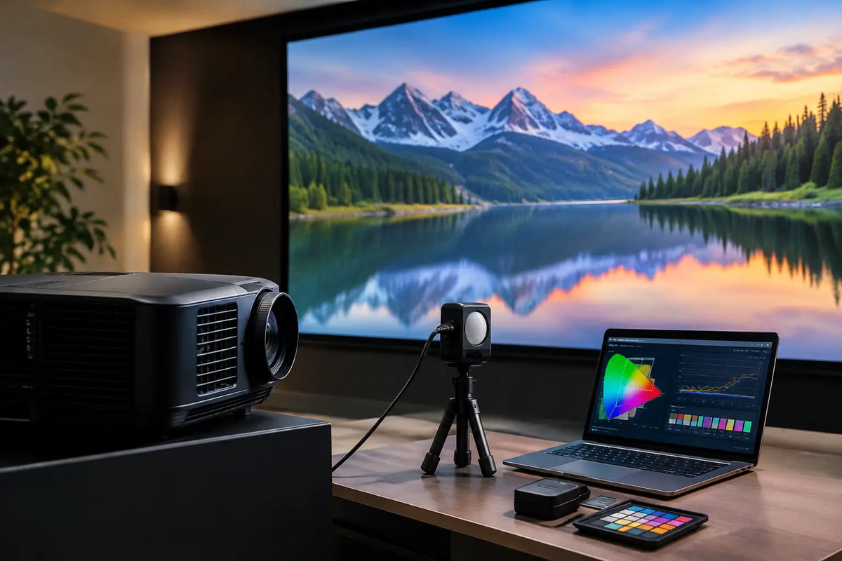
A premium cinema room can have exceptional seating, acoustic treatment, and a beautifully integrated projector, yet still feel disappointing when the image is too blue, shadow detail is crushed, or bright scenes lack dimension. Knowing how to calibrate cinema projector settings is what turns impressive equipment into a convincing cinematic experience - one that respects the director’s intent while complementing the character of your room.
Calibration is not simply increasing brightness until the image looks dramatic. It is a measured process of aligning the projector, screen, source equipment, and viewing environment so they work as one system. The right result is natural color, convincing contrast, clean detail, and comfortable viewing over a full-length film.
Start With the Room, Not the Remote
A projector cannot be calibrated in isolation. Before changing picture controls, establish the conditions in which the cinema will actually be used. Light-colored walls, reflective ceiling finishes, glossy furniture, and uncontrolled window light can all reduce perceived black level and contrast. Even a high-performance projector will struggle to produce a truly cinematic image if light is bouncing back onto the screen.
For a dedicated theater, dark matte finishes around the screen provide the strongest foundation. In a living room or multipurpose space, motorized blackout shades, controlled lighting scenes, and carefully selected wall finishes make a substantial difference. The screen itself matters just as much. Its size, gain, material, and ambient-light-rejecting properties must suit the projector’s light output and the room’s intended use.
Allow the projector to warm up for at least 30 minutes before making serious adjustments. Light output and color behavior can shift as the unit reaches operating temperature. If the projector has recently been installed, confirm that its throw distance, zoom position, focus, lens shift, and screen alignment are already correct. Geometry should never be corrected with digital keystone unless there is no alternative, since it can reduce image detail.
How to Calibrate a Cinema Projector in the Right Order
The order of calibration matters. Adjusting color before establishing brightness, contrast, and grayscale can produce a picture that looks appealing at first but falls apart in darker scenes or across different sources.
Choose the correct picture mode
Begin with the projector’s most accurate preset, often labeled Cinema, Film, Reference, Filmmaker, or a similar name. Avoid Dynamic, Vivid, Sports, and showroom-style modes. These settings are designed to compete with retail lighting, not to reproduce films accurately in a dark, refined theater environment.
Disable automatic features that continuously alter the image while you are calibrating. Dynamic contrast, auto iris modes, frame interpolation, artificial edge enhancement, and aggressive noise reduction can make measurements inconsistent. Some of these features may be reintroduced later in moderation if they improve the experience for your preferred content, but they should not define the baseline image.
Set brightness for visible shadow detail
Brightness controls the black level, not the overall light output. Use a black-level test pattern with near-black bars or steps. Lower the setting until the darkest reference black blends into the background, then raise it just enough that the next-darkest steps remain visible.
Set too low, brightness crushes detail in dark suits, nighttime cityscapes, and textured shadows. Set too high, blacks become gray and the image loses depth. This is one of the most meaningful adjustments in a theater, particularly with projection, where the room and screen have a direct influence on perceived contrast.
Set contrast without clipping highlights
Contrast determines how bright the upper end of the image can become before highlight detail disappears. Use a white clipping pattern and increase contrast until the brightest steps begin to merge, then reduce it slightly until fine detail returns.
The goal is not the brightest possible white. It is controlled brightness with detail intact. Clouds should retain shape, pale fabric should show texture, and sunlit surfaces should not become a flat white patch. With HDR content, this control interacts with the projector’s tone mapping, so a setting that works for standard Blu-ray may not be ideal for 4K HDR movies.
Establish accurate grayscale and white balance
Grayscale is the progression from black to white. When it is correct, neutral tones appear genuinely neutral rather than reddish, greenish, or blue. The industry reference for most film viewing is D65, a white point near 6500K.
Projector menus often provide two-point or multi-point white balance controls, typically using red, green, and blue gain and bias adjustments. Gain influences brighter portions of the image, while bias affects darker areas. Small changes can have a visible impact, and overcorrection can introduce color casts elsewhere in the grayscale.
This is where a calibrated color meter and dedicated software become valuable. Visual adjustment can get close, but the human eye adapts quickly to a color cast. A meter identifies errors that may not be obvious until you compare the projector with a known reference.
Align color gamut and saturation
For SDR film content, Rec. 709 is the primary target. For HDR, projectors commonly use a wider color container, often associated with BT.2020, while the actual color capability depends on the projector, its light source, and any color filter in use.
Select the appropriate color gamut mode for the content and avoid assuming that the widest option is always best. A wide-gamut setting can make colors look exaggerated or inaccurate when watching SDR material. Skin tones are the most revealing test: they should look alive and natural, not overly red, orange, or pale.
Advanced controls for color management may allow adjustment of hue, saturation, and luminance for primary and secondary colors. These controls are best handled with measurement tools. Moving them by eye can improve one color while damaging another, particularly when the screen material shifts the way color is reflected back into the room.
Treat SDR and HDR as Separate Calibrations
A cinema projector should not use one universal picture preset for every source. SDR streaming, Blu-ray, 4K HDR discs, gaming, and broadcast television all place different demands on the display.
For SDR, the objective is generally Rec. 709 color, D65 white balance, and a gamma setting suited to the room. A darker dedicated theater may benefit from gamma around 2.4, which gives the image richer depth. A room with some unavoidable ambient light may look more balanced at 2.2. Neither choice is automatically right - the room determines the better compromise.
HDR is more complex because most projectors cannot reproduce the peak brightness of a flat-panel HDR display. Tone mapping determines how the projector translates bright HDR information into its available light range. Use familiar HDR scenes with fine highlight detail to judge the result. If bright scenes appear washed out, adjust tone mapping toward deeper contrast. If they look too dim or highlights disappear, prioritize a brighter rendering. The best setting depends on the projector, screen size, screen gain, and the content itself.
Do Not Ignore the Source Chain
A carefully calibrated projector can still look wrong if the source device is outputting an incorrect signal. Confirm that the streaming player, AV receiver, disc player, or media server is set to the correct resolution, frame rate, color format, and dynamic range. A source forcing HDR on SDR content, or converting everything to a limited output mode, can undermine otherwise excellent work.
The AV receiver should pass video without unnecessary processing unless its video scaling is specifically part of the system design. High-quality HDMI cabling and reliable signal distribution are also essential for 4K HDR projection, especially in large homes where cable runs may be long.
For a luxury home cinema, this integration is where engineering matters. The projector, screen, lighting, control system, audio system, and sources should respond as a considered environment rather than a collection of independent products. A single cinema scene can lower blackout shades, dim architectural lighting, select the correct input, and place the projector in the appropriate calibrated mode.
When Professional Calibration Is Worth It
Basic adjustments using quality test patterns can make a meaningful improvement. However, professional calibration is the better choice when you have invested in a dedicated theater, a premium laser projector, an acoustically transparent screen, or a large-format installation. It is also worthwhile after replacing a lamp, changing the screen, renovating the room, or noticing that the image has drifted over time.
A professional process uses a colorimeter or spectrophotometer, calibration software, and repeatable measurement patterns. More importantly, it considers the whole viewing environment. The goal is not to chase a number in a menu. It is to create an image that performs properly from the first frame to the closing credits.
At I-Trust Systems, cinema design is approached as a complete sensory experience, where image accuracy, room acoustics, lighting control, and visual refinement receive equal attention.
The final test is simple: choose a film you know well, lower the lights, and let the image disappear into the story. When faces look natural, black scenes retain texture, highlights feel controlled, and nothing about the picture calls attention to itself, the cinema is doing exactly what it should.
Share:
Centralized Versus Zoned HVAC: Which Fits?
Cinema Technology That Makes a Private Theater Exceptional